I am DARIUS BAJINA
and I'm a digital

  • Designer

  • Producer

  • Expert

The type of Work I do

Design

I have always had a passion for creativity and design. And showcasing my ideas online to a wider audience seemed like the logical step to take. As technology evolves, design techniques change too, so I try to keep up-to-date with the latest trends to create clean design layouts and always try to improve my designs/design layouts and I am always researching the newest and best new creative ideas around.

Development
& SEO

I also have good development skills in order for my designs and layouts to come to life online. I have knowledge of various coding languages such as HTML, CSS/SASS, JavaScript, JQuery, BootStrap etc. I also keep up-to-date with the latest aspects of Search Engine Optimisation (SEO) making sure all pages are designed and coded that increase page popularity on search engines websites.

Production

Production takes all elements of design and development, and puts it all together. Having good production skills has enabled me to not only continue my design and development work but also has given me the opportunity to learn managerial skills in leading a team and also leading colleagues with differing skill sets.

Applications

Some of the design/development applications that I know are Adobe Suite including Photoshop, Figma, Dreamweaver, Illustrator, Indesign, Flash, IBM Management Centre, FredHopper, Amplience (image uploader), Adobe Scene7 (image uploader), HTML/CSS, JavaScript, Bootstrap, Microsoft Suite and more.

Darius Bajina Personal Portfolio

Darius Bajina Personal Portfolio

Darius Bajina Personal Portfolio

Hello, I am Darius Bajina...

I'm a digital designer as well as a senior digital designer from London. I have over 10 years experience in the web/digital design and production industry and I have worked with companies like Yahoo! creating designs for the Yahoo! and Yahoo! Mobile website in particular and Debenhams where I was the Senior Digital Design & Production Coordinator, whereby I created and updated all the digital design aspects of the platforms (website, mobile, tablet for the UK, ROI and international sites, kiosk, Amazon & ebay stores) for the company. I am currently working as a Digital Content Design Manager at Currys. My aim is to help and try and make Currys the best shopping experience as it can be, giving a fantastic customer/user experience along the way.
I like pixel perfect layouts and I am a very confident user of design software such as Adobe Photoshop, Illustrator, Indesign, Figma, Dreamweaver, Flash etc. and have good knowledge of HTML, CSS/SASS. I also have knowledge of JavaScript, Jquery and recently BootStrap, but I am training to improve upon my knowledge of JQuery & BootStrap.
I have always been inspired by designing from a young age, but especially online and over the last few years I have adapted to the changing of the times and industry, in that we now also design and produce online designs for websites, mobile, apps and various other digital platforms whilst also including the use of SEO as part of our design work to enhance the user experience even further.
I am confident performing under pressure and operating in a fast-paced environment, whilst also enjoy creating and testing new design concepts to improve traffic and customer experience.
Creating and producing vibrant and inspiring designs is not just a job for me, it's a passion!
Away from designing, I like to travel when I can, photography, trying out new foods and also like lots of sports such as football, athletics, generally keeping fit and I'm game for trying out anything new too.

View my Works
80

Digital / Web Design

75

HTML / CSS

80

Graphic Design

60

UI / UX

The works I am proud of

Currys Home Page Thumbnail - Darius Bajina Personal Portfolio

Currys Home Page

currys.co.uk & currys.co.uk/mobile

The Currys.co.uk Home Page is a page I am responsible for in terms of creating the weekly updates to it from a design and content prespective. In my time at Currys we have traisitioned from a bespoke inhouse CMS, which was using HTML and CSS coding to update the home page, to recently updating the home page using Amplience CMS which is more templated based. I try and make the home page concise and consistent, by keeping to the companys guidelines and toolkits we are given. They are still trying to transistion into a digital first company and have already started making this change with the new CMS. Below are a selection of the Home Page iterations I have both designed or was was part of designing and uploading the home page.

Applications/programmes used to create all variations of the Currys/Currys Mobile Home Pages: Amplience CMS, BackOffice (in-house besoke) CMS, FileZilla, SCUD (in-house besoke for Currys Mobile) CMS, Sketch Cloud, Adobe Photoshop and Illustrator.

Current Omni Channel Currys Home Page:
This is Currys' new home page which is created within the companies new Amplience CMS which was rolled out in early 2022. All elements are more of a templated design, which helps making the home page more responsive on mobile and tablet versions and not having to craete separate imagery for those digital devices.

Current Currys Home Page 2022 - Darius Bajina Personal Portfolio

Brand Exclusive Promotion Home Page Takeovers:
As a brand/company exclusive, Currys had a couple of days wheerby a big-name brand can "takeover" the home page with a new lauunced product. We had 2 major takeovers in the first few months of 2022 on our new omni channel site. We had a takeover from Apple and Sasmung. I helped in the design and uploading of the takeover pages which had to be checked and signed off by the brands before going live. All in all both takeivers were only live for 24 hours and proved to be successful.

Applications/programmes used to create the Brand Exclusive Promotion Home Page Takeovers: Sketch Cloud, Adobe Photoshop, Amplience CMS.

Apple Brand Exclusive Promotion Home Page Takeover:

Apple Brand Exclusive Promotion Home Page Takeover - Darius Bajina Personal Portfolio

Samsung Brand Exclusive Promotion Home Page Takeover:

Samsung Brand Exclusive Promotion Home Page Takeover - Darius Bajina Personal Portfolio

Pre-Omni Channel Currys Home Page and Currys Mobile Home Page Designs:
When I first started at Currys, we had used a besoke in-house built CMS called BackOffice that created the Home Page. We had a lot more licence to create and design elements as they were done individually for desktop, mobile and tablet. And we had to use HTML/CSS code to update the elements within BackOffice. I worked on the day-to-day updates of the page and also and helped coming up with ideas and in creating new Home Page designs for the website whilst keeping it clean, concise and easy for customer experience. See below some of the first iterations of the home pages for Currys and Currys mobile websites that I was a part of helping to design, build and upload.

Applications/programmes used to create the Pre-Omni Channel Currys Home Pages: Sketch Cloud, Adobe Photoshop, BackOffice CMS, SCUD CMS, HTML/CSS code.

Pre-Omni Channel Currys Home Page & Currys Mobile Home Page - Darius Bajina Personal Portfolio
Debenhams Home Page Thumbnail - Darius Bajina Personal Portfolio

Debenhams Home Page

debenhams.com, .ie & .int

The Debenhams.com Home Page is a page I have been responsible for from the moment I walked into Debenhams. From my very first home page creation - which I incorporated HTML/CSS code at the time when it was never being used, to the various updates/changes during my time there, to the most recent home page updates - I have been a part of making, designing and bringing to life the Debenhams Home Page which is clean, concise and consistent, keeping to the companys guidelines and easy for a great customer experience. Below are a selection of the Home Page iterations I have both designed and was a part of in the changing of the look and feel during the years, keeping the Home Page looking fresh and up-to-date with the changing of times and introduction of new applications/ technologies such as mobile and apps.

Applications/programmes used to create all variations of the Debenhams Home Pages: IBM Management Centre v5 and v7, Blue Martini (pre-2007 Home Pages), Adobe Photoshop & ImageReady, Illustrator and Amplience, (pre-October 2019 Adobe Scene7).

Jan 2019 - Current Home Page:
Applications/programmes used to create the Debenhams International Home Pages: Adobe Photoshop, IBM Management Centre v7, Amplience, (pre-October 2019 Adobe Scene7).

Current Home Page 2020 - Darius Bajina Personal Portfolio

2014 - April 2020 International Home Pages:
As the website grew, we had to start catering for our International customers. We kept the Home Page design very similar to the Dotcom/Dotie websites, whereby we would have 3 hero rotations, and a block of various other offers below that. We also had to split out countries, such as Australia and New Zealand and do separate designs for these countries as they would have differing promotions depending on the time of season e.g. if it is summer in any northern hemisphere country then southern hemisphere countries would have more wintery promotions. We currently cater for 66 countries and are continuing to develop the INT Home Pages.
As of April 2020, partly due to the Covid-19 pandemic, Debenhams have paused the INT sites until further notice.

Applications/programmes used to create the Debenhams Home Pages: Adobe Photoshop, IBM Management Centre v7, Amplience (pre-October 2019 Adobe Scene7).

Current International Home Page 2017 - Darius Bajina Personal Portfolio

There have been many different designs/changes of Home Pages over the years. I work on both on the day-to-day updates of the page and also and helped coming up with ideas and in creating new Home Page designs for the website whilst keeping it clean, concise and easy for customer experience. See below all of the Home Page designs I have created and also the Home Page changes that I have been a part of.

Dec 2005 - Nov 2007 Home Page Design:

Home Page Design 2005-2007 - Darius Bajina Personal Portfolio

Nov 2007 - Jan 2010 Home Page Design v2:

Home Page Design 2007-2010 - Darius Bajina Personal Portfolio

Jan 2010 - Feb 2011 Home Page Design v3:

Home Page Design 2010-2011 - Darius Bajina Personal Portfolio

Feb 2011 - Dec 2011 Home Page Design v4:

Home Page Design 2011 - Darius Bajina Personal Portfolio

Dec 2011 - Oct 2012 Home Page Design v5:

Home Page Design 2011-2012 - Darius Bajina Personal Portfolio

Oct 2012 - Dec 2013 Home Page Design v6:

Home Page Design 2012-2013 - Darius Bajina Personal Portfolio

Dec 2013 - Oct 2014 Home Page Design v7:

Home Page Design 2013-2014 - Darius Bajina Personal Portfolio

Oct 2014 - Dec 2015 Home Page Design v8:

Home Page Design 2014-2015 - Darius Bajina Personal Portfolio

Dec 2015 - Jan 2019 Home Page Design v9:

Home Page Design 2015-2019 - Darius Bajina Personal Portfolio
Debenhams Mobile Thumbnail - Darius Bajina Personal Portfolio

Debenhams Mobile

m.debenhams.com, .ie & .int

The Debenhams website is also now responsive and we are changing as many of the pages on the website so they are responsive and work on mobile and tablets. Below is an example of the Debenhams Home Page, both the desktop version and a mobile and tablet variations.

Responsive Desktop and Mobile - Darius Bajina Personal Portfolio Debenhams Tablet Home Page - Darius Bajina Personal Portfolio

Below are a couple of more examples of the mobile version of pages that we build with the desktop versions. These pages are responsive so we are not creating mobile/tablet pages separately. Shown below are various responsive mobile pages that I have helped create. The Red keyline framed = Christmas landing page; Black keyline frame = Gifts TCAT page; Pink keyline frame = Beauty Page; Orange keyline frame = Gifts for Her landing page; Blue keyline frame = Midnight Magic/Style Edit Page.

Various Debenhams Mobile Pages - Darius Bajina Personal Portfolio
User Interface Project: Debenhams Recover Abandon Basket Thumbnail - Darius Bajina Personal Portfolio

UI Project: Debenhams Recover Abandon Basket

debenhams.com & .ie

As with any online retailer, shopping basket abandonment is a big challenge at Debenhams. We were tasked to look into how we can target abandon baskets. Working alongside Product Owners and the development team, we designed and delivered a solution that saw a £5m revenue uplift.

The Problem:

We noticed that customers were browsing the website and then not buying, leaving products in the basket and not purchasing or leaving the website. So the goal of the task is to come up with a solution to re-engage customer interest at the shopping basket level in order for them to make that final push to purchase and increase conversion rate.

The Project:

My colleague who was the UX researcher gathered the user data to enable myself and the UI/UX members of the team to come up with a number of low fidelity solutions (basically creating line drawings which we then create into wireframes). We all discussed what would be needed, what ideas could be discarded and began creating the wireframes. Unfortunately at the time the was a budget freeze and we couldn’t do much user gathering such as user group gathering of data so we used the information gathered from Google analytics and also conducted competitor analysis to see what they were doing to keep the customer engaged and get conversion.

The most common theme from the research gathered for the customer not completing the final step in the journey to purchasing products were as follows:

  • Unexpected shipping/delivery costs
  • High product pricing
  • Shopper was conducting research with the intention to buying later
  • No 'Guest' checkout option - some shoppers prefer to shop without having to create an online account
  • Long and confusing checkout process
  • Shoppers faced technical difficulties

Around 75% of customers who left their shopping basket without purchasing returned to the site within 30 days and 1 in 4 customers who left products in their basket coming back to make a purchase. The best channel for pushing re-visits to the site is by e-mail (67%) – with customers three times more likely to buy and spend 55% more.

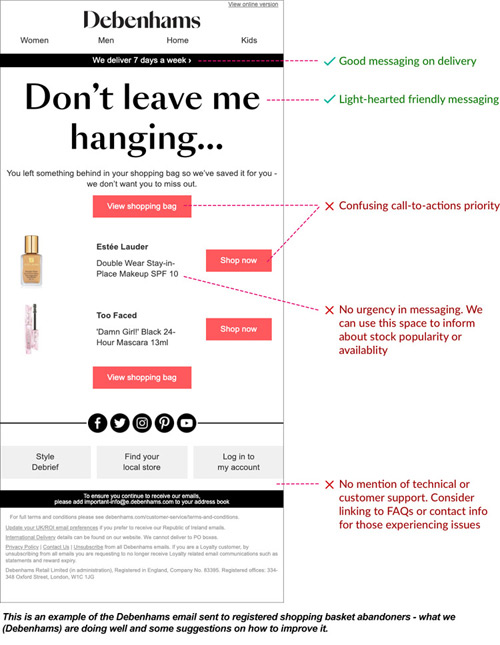
We (Debenhams) already have a rule in place to remind registered customers that they have something in their baskets that they have not purchased yet but further improvements could be made to this too in increase the customer engagement to purchase.

User Interface Project: Debenhams Recover Abandon Basket Image 1 - Darius Bajina Personal Portfolio

Re-engage the digital customer on-site:

We decided to focus our efforts on re-engaging the customers who left their shopping basket but come back to the site. Our initial task was to come up with some low fidelity wire framing (hand-drawn ideas first) and then create a low fidelity wireframe online once we decided what we wanted to showcase to the customer to re-engage them. As we were going to be doing A/B testing we wanted to find out whether providing product information will achieve better results and the effect of the placement of the message would have on the customer mindset. Once we started the high fidelity wireframe we decided to re-use the existing UI component library components without having to come up with any new UI components.

User Interface Project: Debenhams Recover Abandon Basket Image 2 - Darius Bajina Personal Portfolio

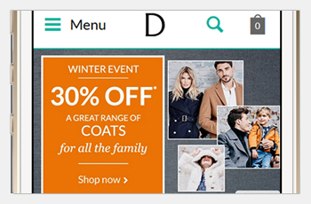
Mobile variants (below):

User Interface Project: Debenhams Recover Abandon Basket Image 3 - Darius Bajina Personal Portfolio

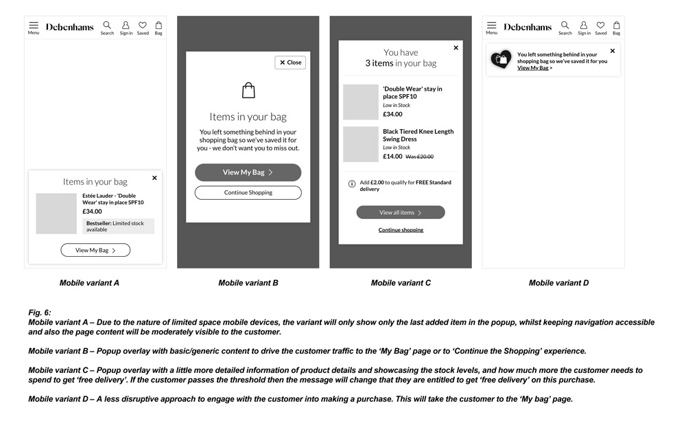
Mobile first approach:

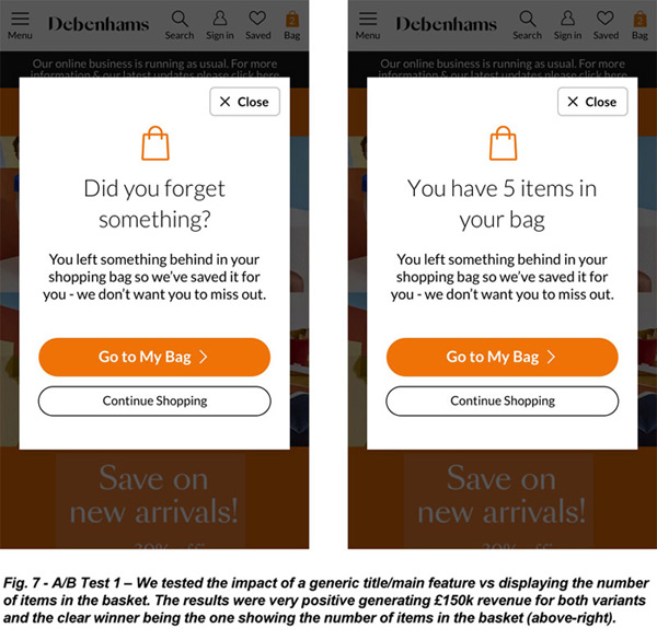
Out of the 4 variants we decided to go with variants B and C to commence our A/B Test. Variant B required less development time and could be rolled out within the current CMS parameters and onto our testing site and would not require a sprint deployment. Due to this factor we were able to test two differing copy variants. One with a generic header ("Did you forget something?"), and the other with number of items in the shopping bag ("You have X items in your bag"). On analysis of the 2, both were very strong with the latter variant coming out as the winner. This then led to the idea that there was a very good possibility that an even better results would come from showing product information.

User Interface Project: Debenhams Recover Abandon Basket Image 4 - Darius Bajina Personal Portfolio

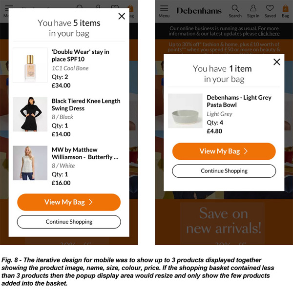
UI iteration for mobile view:

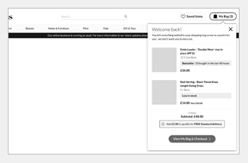
With the idea of showcase more product information this would have needed the development team to come up with the solution. As it was, we ran into development issues in that there were technical restraints around providing stock availability on the pop up on the Mobile bag. As such we did some changes to the design. Mobile users tend not to scroll down so the popup will show 3 products maximum showcasing the product image, name, size/colour, quantity and price. If the customer buys less than 3 items the then the pop up will resize and shorten. If the customer bought more than 3 items then the last 3 items put into the shopping basket will be shown, but there will be the total number of items indicated in the title.
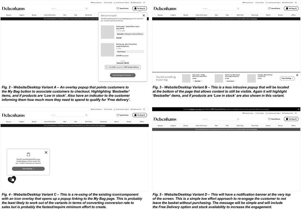
User Interface Project: Debenhams Recover Abandon Basket Image 5 - Darius Bajina Personal Portfolio

Desktop variants:

For the desktop variant test I proposed 3 versions to test at engagement level. One would be a full page popup so the customer cannot really miss it, verses a less intrusive top right hand corner popup that points the customer to the My Bag page and the third test was to see the placement of the popup located at the very bottom of the page.

User Interface Project: Debenhams Recover Abandon Basket Image 6 - Darius Bajina Personal Portfolio User Interface Project: Debenhams Recover Abandon Basket Image 7 - Darius Bajina Personal Portfolio User Interface Project: Debenhams Recover Abandon Basket Image 8 - Darius Bajina Personal Portfolio

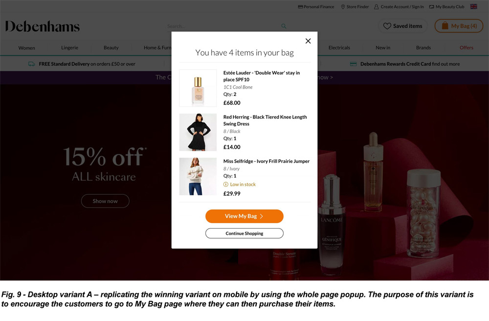
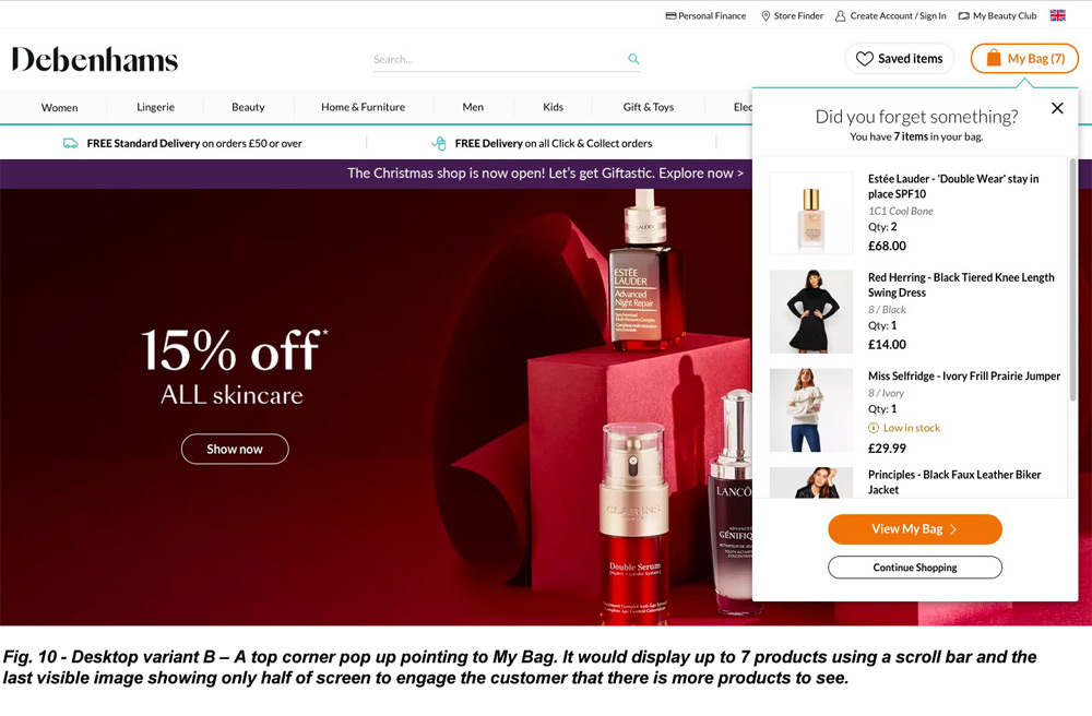
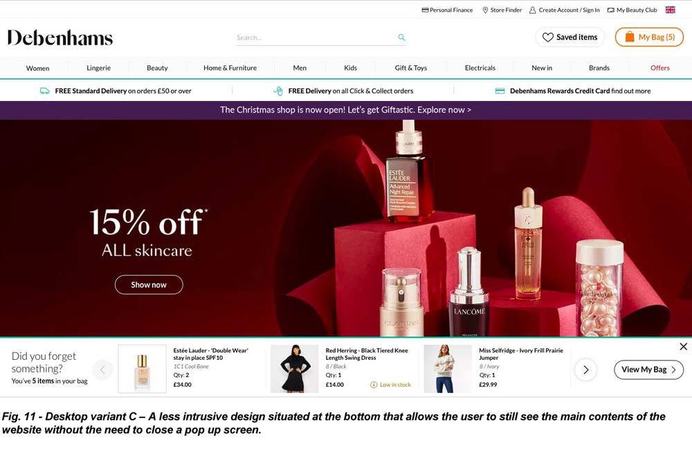
After doing the A/B tests the results showed that all 3 variants gave an uplift in customers purchases and conversion rate increased. From a design point of view I did think Desktop variant C having the products at the bottom of the screen took away some of the digital retail space for the customer and would potentially make them have to scroll a bit more to see products on the page. And the results showed that this variant brought in the least conversion out of the three we tested. The best version was Desktop Variant 2, probably due to the fact that the customer got to visually see more of the products they had added to the basket. But Variant 1 was not too far behind in terms of conversion rate increase.


Conclusion:

In conclusion we reached the outcomes of which of the 2 solutions we would chose for both desktop and mobile and it was interesting to see that we were achieving better results on mobile than desktop as usually we generate more revenue via the desktop site. This could this be due to a shift of user/customer digital needs of a mobile 1st approach. It is something we would need to explore further with our core customer base. The results of this new feature saw an increase in revenue by around £5M.

User Experience Beauty Club Project Thumbnail - Darius Bajina Personal Portfolio

UI/UX Project: Debenhams Beauty Club

debenhams.com

Beauty Club is one of Debenhams' great inicitives for its customers when it was launched and one of the first of its kind on a high street retailers website. It had a strong customer base that had signed up to Debenhams Beauty Club. But lately and in 2020 and during the start of covid pandemic it saw registration declining which meant customers still enjoyed going into store to try out/get their beauty treats along with their beauty purchases.

The Problem:

One of the jewels in the Debenhams business was the Beauty Club inicitive. It was a fantastic card that enabled customers to get promotions, free gifts or use points to purchase more beauty products at Debenhams. But in 2020 registrations were not as high as they once were and also with the start of the covid pandemic and store closures it seemed that the customers had a relience on stores to drive the volume. 62% of online registered customers who purchased beauty products were non-card holders. So by just converting 10% of these customers to beauty club card members could have doubled the customer base.

We soon realised that the customers visiting Beauty Club did not get to see all the benefits for joinging Beauty Club, though from analysis we saw that just under 10% are interested in registering. There was also a problem with the sign-up process in the sense that customers who are not an online Debenhams account holder are required to create an account first. After After they've done that, they were then redirected back to the main Debenhams homepage with no clear indictation of how they can join the Beauty Club from there.

User Experience Beauty Club Project: Image 1 - Darius Bajina Personal Portfolio

Beauty Club Page:

After following the wireframe recommendation from the UX team, we decied it would be a good idea to break up the content of the page with icons to make the page more visably appealing to the customer and easier on the eye. As the page is long and scrollable there is content that sits below the screen fold so we added a "sign up" banner half way down the page for more exposure to the customer and also minumise the need of the customer to scroll all the way back to the top of the page to sign up and hopefully increase conversion rate at the same time.

User Experience Beauty Club Project: Image 2 - Darius Bajina Personal Portfolio

User flow diagram:

In an ideal world registration for the Beauty Club should be combined with the signing up for a Debenhams account so that users do not have to sign up twice. And this is something we would have liked to have pushed out onto the website. Unfortunatly at the time, the development team did not have the appropriate resource to carry this out but it could have been implemented further down the line. So in the meantime we decided to improve the existing flow to the sign up process so customers are redirected to Beauty Club, and they have the option to decide whether they want to join Beauty Club, after they have created a Debenahms account.

User Experience Beauty Club Project: Image 3 - Darius Bajina Personal Portfolio

Beauty Top Category Page (TCAT):

The beauty TCAT is the landing page that customers will normally land upon when they go onto the beauty section on the Beautys website. This is where all the current promotions/brand events are shown to the customer. The Beauty Club promotion ad-spot was way down the bottom of the page and there was no information about the perks of joining Beauty Club. In order to improve the exposure of Beauty Club on this essential page that customers were hitting, we decided to move the Beauty Club ad-spot higer up the page so it had more exposure to the customer and instead of it being an ad-spot and thus maybe blending into the page with the other offers, we created a banner for it to stand out.

User Experience Beauty Club Project: Image 4 - Darius Bajina Personal Portfolio

Order Confirmation Page:

One of the key successes for Debenhams is getting customers to register for an account by showing them the benefits of opening an account on the order confirmation page after they complete their purchase online. So this is another opportunity to also information the customer of the benefits of Beauty Club registration too. We designed a banner for the order confirmation page to target customers who had just purchased a beauty product online but were not a Beauty Club member yet. The banner also including a link to add existing Beauty Club card to their Debenhams account.

User Experience Beauty Club Project: Image 5 - Darius Bajina Personal Portfolio

Conclusion:

As the registraion rate of customers pre-pandemic was consistent, the Beauty Club journey had not been looked into for quite a while. It was only when researching and investigating the sign up process that we discovered there was a possible issue with non Debenhams account holders, thus reducing the exposure of the Beauty Club card. The sign up process could also be greatly improved by giving users the option to sign up for Beauty Club whilst they are registering for a Debenhams online account. This would reduce the need for customers to sign up twice potentially converting more users who don't normally buy beauty products from Debenhams to join the Beauty Club. More testing and data would need to be collected once this has been implemented to review the volume of new sign ups and if there's a decrease in drop off rate.

Unfortunately just after implementing this Beauty Club updates the business went into liquidation and so the data would have been unreliable given customers knew of the impending closure of the company.

Debenhams Logo update Thumbnail - Darius Bajina Personal Portfolio

Debenhams Logo Redesign 2018

debenhams.com, .ie & .int

In 2018 Debenhams wanted to change the look and feel of its logo and brand guidelines. It hired an external agency called Mother Design to come up with a new brand guideline and logo, and in turn updating the current logo that has been on show for nearly 20 years. I was part of a internal group of employees who collaborated and gave ideas to the background of the company, its heritage and what it means to customers in the 21st century for the agency to come up with a new design.

This update of the logo and brand design guidelines was created in Autumn 2018. All the final logo concepts came from the online agency Mother Design, but we also had an input as to what would work, and look good for our brand and whilst at the same time look modern and work for print and digital.

Along side the new logo and brand guidelines, there was a new slogan "do a bit of Debenhams". And this slogan was to be used on all new designs, whether that was digital or print based. The new logo design would be on all newly built Debenhams Stores whilst the current logo design will remain up on current stores and will change to the new design in due course.

The new typeface that was designed by Mother Design was called "Debenhams SangBleu". This was the new typeface we would have to use on all designs going forward. It is a typeface that we all agreed was a modern, distinctive typeface which struck a nice balance between the old and the new. It is a new logo to make the Debenhams stand out from the competition.


Below are some examples of the new logo and brand designs used in both print and digital format on the Debenhams.com and Debenhams.ie websites.

Debenhams New Logo and Branding 2018 Examples - Darius Bajina Personal Portfolio Debenhams New Logo and Branding 2018 Examples - Darius Bajina Personal Portfolio Debenhams New Logo and Branding 2018 Examples - Darius Bajina Personal Portfolio Debenhams New Logo and Branding 2018 Examples - Darius Bajina Personal Portfolio Debenhams New Logo and Branding 2018 Examples - Darius Bajina Personal Portfolio

And here is an example of the new logo on a new store - New Watford Debenhams store

Debenhams New Logo and Branding 2018 - Darius Bajina Personal Portfolio
Debenhams Style Edit Thumbnail - Darius Bajina Personal Portfolio

Style Edit / Style Debrief (online style magazine)

debenhams.com & .ie

Style Debrief (also formerly known as Style Edit and Be Inspired) is the Debenhams Online magazine that I have been part of creating for the website since its inception. Initially called Be Inspired, then Style Edit and now Style Debrief. It showcases all the latest fashions, trends and the 'what's hot right now' products that you can get at Debenhams, or something very similar to what the stars are wearing/showcasing.

This update of the online magazine page was created in late 2015. The original Be Inspired pages were good and informative but we needed an update. Something new and fresh for the customer to engage with and also something that can be seen on mobile too. This new variation has 7 different types of templates that we designed and created so there were options to have different kinds of pages. I worked together with the development team, content team and the editorial team to put together these 7 templates. The editorial team are the main stake holders of the page and come up with the information and imagery to use but mainly myself or a member of my sub-team would create the new pages to put onto the websites.

We have about 3-5 new style debrief pages pages that go live every week, ranging from womenswear, menswear, kidswear, homeware, beauty, gifts and toys pages. All these pages shows the customer the newest trends.

These style debrief pages work very well for the Debenhams websites (both UK and Ireland websites), and these newly styled pages had its best ever return in terms of profit during Valentine's Day 2016 (this was the best ever page at time of writing). The page that got the most profitable return was the 'Gifts for Him Valentine's Page'.

Style Edit Record Page Valentine's Day 2016 - Darius Bajina Personal Portfolio

We also started to put video content onto these style debrief pages, initially during the Christmas 2015 Debenhams TV advertisement promotion. And it proved to be a resounding success, with customers who visited the page could see the video and directly below the video see the products to buy in that particular video - there were 7 different video pages in total.

In order to come up with these improved pages, we created a template guide showcasing how these pages will look like on both desktop and mobile as these new and improved pages were created so that it was responsive.

Debenhams Style Edit Template Guide - Darius Bajina Personal Portfolio

Below are some examples of the different Style Debrief pages/templates that I create on a weekly basis for the Debenhams.com and Debenhams.ie websites. These are also responsive on mobile platforms.

Debenhams Style Edit Template Design Examples - Darius Bajina Personal Portfolio Debenhams Style Edit Template Design Examples - Darius Bajina Personal Portfolio Debenhams Style Edit Template Design Examples - Darius Bajina Personal Portfolio Debenhams Style Edit Template Design Examples - Darius Bajina Personal Portfolio
Debenhams Kat Von D Thumbnail - Darius Bajina Personal Portfolio

Kat Von D - Debenhams Exclusive Online Launch

debenhams.com

Kat Von D, when it launched on Debenhams.com and Debenhams.ie in September 2016, was an 'online exclusive' for Debenhams and then later sold in-store.

On the launch of the Kat Von D brand page and social media page that I built for Debenhams, it was "the best launch of a beauty brand on debenhams.com" and it was also the best online launch worldwide in terms of revenue.

Kat Von D Coming Soon - Sign Up Page:
Kat Von D was a Debenhams Exclusive launch. Initially online and then in-stores. It was a highly anticipated launch as no other high street retailer had this brand as part of their beauty portfolio and Debenhams were one of the first in the UK.

Debenhams Kat Von D Coming Soon Page - Darius Bajina Personal Portfolio

Kat Von D Page:
This is the Kat Von D page that launched as a Debenhams Online Exclusive. Highlighting all of the Kat Von D brands beauty essentials, and also video's showing their products and information about Kat Von D herself. We also showed a social media feed from all customers who posted their experiences with Kat Von D products online via Instagram, which again was a great success and ranked highly on Google.

Debenhams Kat Von D Brand Room Page - Darius Bajina Personal Portfolio

Various Beauty Pages Thumbnail - Darius Bajina Personal Portfolio

Various Beauty Pages

debenhams.com & .ie

Debenhams has a wide range of the best and well-known beauty brands in the market today. Moreover, in order to cater for their needs and also the customers, we build bespoke brand rooms for each brand, all using the Debenhams component templates. These beauty brand rooms are updated on a weekly basis, around 15-20 brand rooms per week. That may seem a lot but it isn't, especially when you consider the amount of beauty brands that are catered by Debenhams online. The brands themselves also have a say in how their own brand room on the Debenhams site is set and built before it goes onto the live website for customers to see.

Below is a selection of Beauty Brand Rooms that I or my team have built for various beauty brands.

Beauty Brand Room Pages - Darius Bajina Personal Portfolio Beauty Brand Room Pages - Darius Bajina Personal Portfolio Beauty Brand Room Pages - Darius Bajina Personal Portfolio Beauty Brand Room Pages - Darius Bajina Personal Portfolio Beauty Brand Room Pages - Darius Bajina Personal Portfolio
Debenhams TCAT Banners Thumbnail - Darius Bajina Personal Portfolio

Various Debenhams T-CAT Pages & Banners (flash banners & html versions)

debenhams.com, .ie & .int

Debenhams caters for various types of products in fashion, beauty, gifts, homeware and furniture. And as such each of these categories have their own area called Top-Level Categories or "T-CAT" for short. Each T-CAT will showcase the best and most wanted trends for the customer to view and potentially make them interested to buy. They are in a sense a mini home page for that category. These T-CAT category pages have always been on the website since I started but they have evolved, as the website has in look and design. Also with creating these T-CAT pages, we also have to create the Product Selection Page banner or "PSP" banners for short, across the site too. These banners sit on the pages below the T-CAT page and appear on the product pages.

As I mentioned, these T-CATs and PSP banners have changed and evolved just as the website has over the years, and below is a sample of just how these T-CAT pages and PSP banners have changed. And I have been involved in updating these pages and was part of any new updates to these T-CAT and PSP banners along the way too.

2005 - 2007 TCAT and Banners Design:
These were some of the very first T-CAT pages that I had to update and it included PSP banners at the top, top-right corner and a right-sided banner:

Debenhams TCAT and Banner Design - Darius Bajina Personal Portfolio

2007 TCAT and Banners Design v2:
We incorporated Flash animation onto the website and also made the T-CAT and PSP Banners flash animated too:

Debenhams Flash Animated Banner Design - Darius Bajina Personal Portfolio

2007 - 2010 TCAT and Banners Design v3:
As the website evolved, we moved away from showing various categories on the T-CAT page to just three main areas. The other categories would still be showcased in the left-hand navigation:

Debenhams TCAT and Banner Design - Darius Bajina Personal Portfolio

2009 TCAT and Banners Design v4:
The beauty page started to bring in a lot of revenue and so it was decided to alter that T-CAT page for beauty so it was able to incorporate a lot more brands and offers. The Tripp splash page also showed how the website was now enabled to create bespoke pages now it moved to the IBM content management system:

Debenhams TCAT and Banner Design - Darius Bajina Personal Portfolio

2010 - 2013 TCAT and Banners Design v5:
With yet another website update/change, the way the T-CATs were portrayed changed too. We now wanted more variety so we had 1 main/hero image and 6 ad-spots underneath:

Debenhams TCAT and Banner Design - Darius Bajina Personal Portfolio

2013 - 2014 TCAT/Banners Design v6:
Another website update kept the same format the T-CATs were in, but changed the way the imagery was. We also changed the placement of the links from the top of the ad-spots to the bottom as shown in the examples below:

Debenhams TCAT and Banner Design - Darius Bajina Personal Portfolio

2015 Current Design - TCAT and Banners Design v7:
These are the latest T-CAT designs we have on the website. We are making them more responsive and so a change to the layout effectively making some look like a splash page.

Debenhams TCAT and Banner Design - Darius Bajina Personal Portfolio Debenhams TCAT and Banner Design - Darius Bajina Personal Portfolio

Banner Designs:
Various types of PSP banner designs we currently use on the website and also the Drop Down Navigation banner:

Debenhams Banner and Top Drop Down Navigation Design - Darius Bajina Personal Portfolio
Debenhams Clubs Thumbnail - Darius Bajina Personal Portfolio

Debenhams Clubs Promotion

debenhams.com

In the autumn of 2007, Debenhams embarked on a project called "Debenhams Clubs". These clubs would feature some of the newest designs from the Designers at Debenhams ranges. This was a massive promotion at the time, with major advertising on TV, radio, newspapers and magazines whilst also taking over all of the billboards within Bond Street Tube Station in London, and also promoting in-store. The Clubs promotion ran until Summer 2008 and was a marketing and online success, helping the Designers ranges get even more exposure of their styles and product lines to current and new customers.

I was in charge of the creating of these Club pages on the website. We were restricted with the systems and content management system that we had at the time, but I still created the page as per the design requirements from the marketing team. Below are a couple of examples of the Clubs that we had, and in the screen slide-show above are some of the advertisement posters that were used.

Debenhams Clubs Pages - Darius Bajina Personal Portfolio Debenhams Clubs Pages - Darius Bajina Personal Portfolio Debenhams Clubs Pages - Darius Bajina Personal Portfolio
Debenhams Beauty Club Thumbnail - Darius Bajina Personal Portfolio

Beauty Club

debenhams.com & .ie

Debenhams Beauty Club was launched to give Debenhams customers an exclusive points for each beauty purchase. If they get enough points, they can then redeem them towards another beauty product. I was part of the team that started and created the online presence of the Beauty Club. We had one site that catered for the United Kingdom and another site catering for people from the Republic of Ireland. These points can be used either in-store or online.

During the creation of the Beauty Club the initial design and concept didn't change too much. The design changed to incorporate any new Debenhams site change to keep the pages consistent. However, it was not until 2015 that the Beauty Club pages had a big over-haul in how it looked to the customer. We wanted to keep this consistent for the existing customer but also wanted and needed to bring it up-to-date with the times, such as making the pages responsive for mobile devices.

In the two images below of the Beauty Club Home Pages, on the left you will see the first Beauty Club Home Page at the time of its launch in 2009. On the right, you will see a change to the Beauty Club Home Page in keeping with how the Debenhams.com website had changed its overall look in 2010, the Beauty Club Home Page was designed to be look like a T-CAT (top level category page).

Debenhams Beauty Club Design - Darius Bajina Personal Portfolio

In the two images below it gives customers an idea of what Beauty Club is and how points are earned and used.

Debenhams Beauty Club Design - Darius Bajina Personal Portfolio

In 2015, again in accordance to how the Debenhams website looked and to keep things consistent the Beauty Club Home Page was altered in design. The biggest change to the Beauty Club design happened in 2016 (as seen on the image on the right below).

Debenhams Beauty Club Design - Darius Bajina Personal Portfolio

The biggest change to the Beauty Club pages, since its inception, probably happened recently in early 2016. It was felt that Beauty Club had strayed a little, and needed a new updated look and something that made it look exclusive for the customer-base again. So we came up with a design concept, not veering away too much from the main Debenhams design. The new look Beauty Club pages filled out the whole page on desktop versions, and were now also responsive for mobile devices for the first time - as seen in the below imagery.

Debenhams Beauty Club Design - Darius Bajina Personal Portfolio
Debenhams Be Inspired Thumbnail - Darius Bajina Personal Portfolio

Be Inspired / Style Edit (online style magazine)

debenhams.com & .ie

Be Inspired, and then known later as Style Edit, was the Debenhams Online magazine that I have been creating for the website since its inception. It showcases all the latest fashions, trends and the 'what's hot right now' products that you can get at Debenhams, or something very similar to what the stars are wearing/showcasing. It also had features like Editor's picks whereby people within Debenhams Editorial team and also from heads of departments make a selection of picks for the customer. I have been involved in creating these Be Inspired / Style Edit pages from the beginning and have also been part of the changes the online magazine has gone through. It is now called Style Debrief (see Style Debrief section for how the online magazine has changed and is now responsive).

Shown below are some of the pages that I have helped build and create, and the 3 versions/updates that had happened before the current Style Debrief layout.

2009 - 2010 - Be Inspired Design:

Debenhams Be Inspired 2009-2010 Page Design - Darius Bajina Personal Portfolio Debenhams Be Inspired 2009-2010 Page Design - Darius Bajina Personal Portfolio Debenhams Be Inspired 2009-2010 Page Design - Darius Bajina Personal Portfolio

2010 - 2013 - Be Inspired Design:

Debenhams Be Inspired 2010-2013 Page Design - Darius Bajina Personal Portfolio Debenhams Be Inspired 2010-2013 Page Design - Darius Bajina Personal Portfolio Debenhams Be Inspired 2010-2013 Page Design - Darius Bajina Personal Portfolio Debenhams Be Inspired 2010-2013 Page Design - Darius Bajina Personal Portfolio

2013 - 2015 - Style Edit (Be Inspired) Design:

Debenhams Style Edit 2013-2015 Page Design - Darius Bajina Personal Portfolio Debenhams Style Edit 2013-2015 Page Design - Darius Bajina Personal Portfolio Debenhams Style Edit 2013-2015 Page Design - Darius Bajina Personal Portfolio Debenhams Style Edit 2013-2015 Page Design - Darius Bajina Personal Portfolio
My First Debenhams Home Page Thumbnail - Darius Bajina Personal Portfolio

Debenhams.com - My First Home Pages for Debenhams

debenhams.com

2005 - 2007 Home Page Design:
When I first started at Debenhams, I noticed how they and the CMS they had only let the main/hero image have just the 1 link. We had a new promotion "20 Designers at Debenhams" and after looking at the CMS more, I told my manager we could incorporate 20 differing links to the 20 designers. I was given licence to give it a go, and I came up with a simple design that let the Home Page have more than 1 link they were used too, and this was my first Home Page for Debenhams, which I am still proud of to this day.

Applications/programmes used to create the Debenhams Home Pages: Adobe Photoshop & ImageReady, Adobe Dreamweaver, HTML, Blue Martini (CMS).

Here are a few examples of some of the very first Home Pages I created and put live for the Debenhams.com website.

My First Debenhams Home Page - Darius Bajina Personal Portfolio My First Debenhams Home Page - Darius Bajina Personal Portfolio My First Debenhams Home Page - Darius Bajina Personal Portfolio My First Debenhams Home Page - Darius Bajina Personal Portfolio My First Debenhams Home Page - Darius Bajina Personal Portfolio My First Debenhams Home Page - Darius Bajina Personal Portfolio My First Debenhams Home Page - Darius Bajina Personal Portfolio
Yahoo Halloween Splash Page Thumbnail - Darius Bajina Personal Portfolio

Yahoo! Mobile Halloween

yahoo.co.uk

One of the first big projects that I created, from start to finish, was the Yahoo! Mobile Halloween page. I had to work under certain Yahoo guidelines, but everything else was entirely my work and concepts that I came up with. Starting off from brainstorming, drafts and designs concepts. Once that was agreed with the team, I then set about creating the Yahoo Mobile Halloween page. The top header was Flash animated with a flying witch flying across the header. Once the design was created for the page, I also had to create similar designs for different parts of the Yahoo website and also create banners for affiliates to put up too. It was a success in terms of click rates and the amount of people purchasing ringtones, wallpapers for their phones, and a piece of work that I was very proud of, and I was also grateful for my then-manager to have the confidence in me and my design skills to create a page from start to finish.

Below is the main Yahoo! Mobile page that I created and was accessible from the main Yahoo Home Page too and came out as a pop-up screen.

Yahoo Halloween Splash Page - Darius Bajina Personal Portfolio

After the success of the Halloween page, my then manager, rang me a year later and asked if I could help out on a short-term/freelance basis and come up with another design for their Halloween page. This time I was given the task to create a Yahoo Halloween page for the new smartphones that was just being introduced at the time. These new smartphones had colour screens, better/real sounds and the games and wallpapers on offer would be more graphical than for the standard mobile phones that most people used at that time. I decided to keep the framework of the page pretty similar, though I knew the imagery would be bigger than what I had done the year previously, due to the bigger sizes of smartphones. I also again used Adobe Flash for creating the header which had a spider in the left going up and down. Here is how the page appeared.

Yahoo Halloween Splash Page - Darius Bajina Personal Portfolio
Yahoo Banner Adverts Thumbnail - Darius Bajina Personal Portfolio

Various Banners / Adverts Yahoo! Mobile

yahoo.co.uk

As part of my work at Yahoo!, I had to come up and create mantles, mini mantles (various sized banners going across all areas around the Yahoo! websites) as well as creating splash pages such as the Christmas page for Yahoo! Mobile. In the examples below I have showcased some of the various imagery that I created for Yahoo! Mobile.

Yahoo Banner Adverts Designs - Darius Bajina Personal Portfolio Yahoo Banner Adverts Designs - Darius Bajina Personal Portfolio
Debenhams Email Thumbnail - Darius Bajina Personal Portfolio

E-mail

email@debenhams.com

When I initially started at Debenhams updating the main email page was also part of my job remit. It basically followed what we were advertising on the main Home Page of Debenhams.com. Then after 18 months we worked a lot more with our Marketing department and also in collaboration with an external company called Steel. We would still create the e-mail design but the team at Steel would then do all the coding and add in the links. Thereafter as the amount of work on the main website started to increase my/my teams workload, it was decided that Steel would take control of the Debenhams e-mail and they would collaborate with our Marketing department.

Below are a few examples of the e-mail pages that I helped design and which went out to Debenhams customers. You will see how the e-mail design changed as we moved with the times back then. With the update, we removed the 'home page' look of the email that we had and simply made it more of an e-mail spread, a bit more like a magazine.

Debenhams Email Design - Darius Bajina Personal Portfolio Debenhams Email Design - Darius Bajina Personal Portfolio Debenhams Email Design - Darius Bajina Personal Portfolio Debenhams Email Design - Darius Bajina Personal Portfolio Debenhams Email Design - Darius Bajina Personal Portfolio Debenhams Email Design - Darius Bajina Personal Portfolio Debenhams Email Design - Darius Bajina Personal Portfolio Debenhams Email Design - Darius Bajina Personal Portfolio Debenhams Email Design - Darius Bajina Personal Portfolio
Debenhams Weddings Pages Thumbnail - Darius Bajina Personal Portfolio

Weddings

debenhams.com/weddings & .ie/weddings

Debenhams Weddings has always been a team project in the amount of pages that had to be created/built and all go live at the same time. When I first joined, the weddings page used to click out to an external link that Debenhams owns called 'www.debenhamsweddings.com'. We still use this external website, but also decided to have our own in-house Weddings site showcasing all the styles and ranges of services that the customers can get from Debenhams. The initial new design was created in 2009. It was largely developed by our development team and had a different look and feel to it compared to how the normal day-to-day website looked like. It then went under various re-designs, in 2010 to make it look more like the rest of the website and not make it feel like something else to the customer. It went under further re-designs in 2015 and recently in Jan 2017. The latest designs making the Weddings pages responsive for mobile use for the first time, similar to how the website had evolved.

Shown below are examples of all the different Debenhams Weddings pages I have been part of in helping creating and putting onto the website and also maintaining the pages and any updates that were needed to the pages.

Weddings Design - 2009:

Debenhams Weddings Pages 2009 - Darius Bajina Personal Portfolio Debenhams Weddings Pages 2009 - Darius Bajina Personal Portfolio Debenhams Weddings Pages 2009 - Darius Bajina Personal Portfolio

Weddings Design - 2010:

Debenhams Weddings Pages 2010 - Darius Bajina Personal Portfolio Debenhams Weddings Pages 2010 - Darius Bajina Personal Portfolio Debenhams Weddings Pages 2010 - Darius Bajina Personal Portfolio

Weddings Design - 2015:

Debenhams Weddings Pages 2015 - Darius Bajina Personal Portfolio Debenhams Weddings Pages 2015 - Darius Bajina Personal Portfolio Debenhams Weddings Pages 2015 - Darius Bajina Personal Portfolio

Weddings Design - 2017:

Debenhams Weddings Pages 2017 - Darius Bajina Personal Portfolio Debenhams Weddings Pages 2017 - Darius Bajina Personal Portfolio Debenhams Weddings Pages 2017 - Darius Bajina Personal Portfolio

Keep in Touch with me

If you have any questions, comments or feedback then please email me using the email form and I shall get back to you as soon as I can.

VALIDATOR: Please select the check-box.